Something that surprised me not that long ago was the effect of images when reading. For example, people have utilized different colors to help with reading comprehension.
 |
An except from an online copy of Harry Potter and the Sorcerer's Stone that uses this color spectrum technique.
|
But at the same time, advertisement companies have used similar techniques to manipulate the brain for consumption purposes. This is what discussed in the PBS Frontline episode
The Persuaders. https://www.youtube.com/watch?v=2ep4yegfk_A&t=6098s

The use of different colors to invoke certain emotions and feelings, the use of fonts for "serious" or "relaxed" purposes, and the specific background image are all factors considered when putting ads and commercials into the world. There is a reason for why fast food places incorporate red as their main color. Red is color that induces the feeling of hunger. It is intended for people to see these fast food places, see the red, feel hungry enough to convince themselves to stop by, and then buy food. Something that business have mastered without the masses having a second thought in questioning it. To us, McDonald's is the stable red M and In-n-Out is the constant red palm trees and funny paper hats.

But even if it isn't on a mainstream scale, the individual packaging on labels is to do the same thing. I first noticed this when a friend showed me an Instagram post of the difference of water labels. When getting water from the soda dispensers, one side was labeled WATER and the other was labeled
Water. The crazy part is how I did read it differently. All it took was a background image, fronts, and colors. But it was enough to show me how unnoticeable these little changes were to make consumers want the water on the right more than the left.

 The use of different colors to invoke certain emotions and feelings, the use of fonts for "serious" or "relaxed" purposes, and the specific background image are all factors considered when putting ads and commercials into the world. There is a reason for why fast food places incorporate red as their main color. Red is color that induces the feeling of hunger. It is intended for people to see these fast food places, see the red, feel hungry enough to convince themselves to stop by, and then buy food. Something that business have mastered without the masses having a second thought in questioning it. To us, McDonald's is the stable red M and In-n-Out is the constant red palm trees and funny paper hats.
  But even if it isn't on a mainstream scale, the individual packaging on labels is to do the same thing. I first noticed this when a friend showed me an Instagram post of the difference of water labels. When getting water from the soda dispensers, one side was labeled WATER and the other was labeled Water. The crazy part is how I did read it differently. All it took was a background image, fronts, and colors. But it was enough to show me how unnoticeable these little changes were to make consumers want the water on the right more than the left.
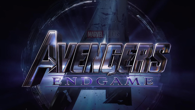

Comments
Post a Comment